Smackathon Winner: Smashup – Best Use of Content
Smackathon Winner: Smashup – Best Use of Content
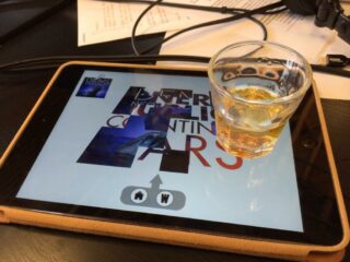
Our Smackathon project was an iPad app called “Smashup”. It is a playful way to create mashups from Sing! performances. Instead of an intimidating DJ style interface, Smashup lets you explore the possibility space between two songs by simply rolling a cube around the screen. Moving quickly creates cuts between the songs, but rocking the cube on one of its sides creates a controllable crossfade.
The app provides cues to help you: the background color is taken from the album cover for the active music track, and the cube’s color comes from the album cover for the active vocals. These two indicators change in real time. Of course, you can add effects to the song: drag the “House” or “Wub” icons up the screen for a different style of buildup and drop. Here’s a video we created to show you how Smashup works:
Smashup was an experiment. It wasn’t about giving you total control of the mix like in DJ software or a DAW, but instead letting you explore unlikely juxtapositions of songs, and to find places where two songs lined up in unexpected and interesting ways. The intuitive interface makes the app infinitely more approachable to users who lack professional training or experience.
– Joel Davis, Senior Software Engineer
Team Smashup: Joel Davis, Ian Siparsky

